
S Y M P L I C I T Y
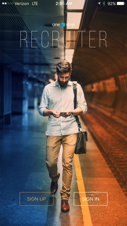
ONESTOP RECRUITER MOBILE APP - IDENTITY AND MARKETING LAUNCH


For the OneStop Recruiter app launch, we created an identity that was consistent with the OneStop brand and color palette, but that was also bold enough to capture the attention of a younger, more contemporary audience of recruiters. Visual style and the choices in imagery portrayed a more vibrant and urban experience than the brand had ever shown before. The "R" icon is dynamic and striking - we likened it to a superhero's logo, which was appropriate since the app would be used by recruiters to help recent graduates find their first job. The campaign ran inside the OneStop product, as well as in print and digital advertising, and the Google Play and Apple app stores.
IDENTITY / CREATIVE DIRECTION: Stephen Szymanski, ICON DESIGN: Chantel McNamara, MARKETING CAMPAIGN /CREATIVE DIRECTION: Stephen Szymanski, COPY: Megan O'Toole, DESIGN: Chantel McNamara, Lindsay Luchtenburg, Megan Gilmore


S Y M P L I C I T Y
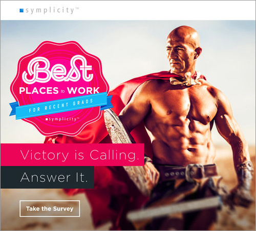
THE BEST PLACES TO WORK marketing CAMPAIGN
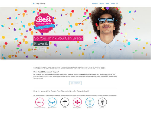
As part of the photography-based rebrand of the firm, we redesigned the annual Best Places to Work campaign to include bold, expressive imagery and a bright color palette which supported and emphasized the campaign's tongue-in-cheek "If you've got it flaunt it" attitude. The final campaign included 6 html emails, 2 landing pages, and a pdf "Winners Packet".
CREATIVE DIRECTION / DESIGN: Stephen Szymanski, DESIGN: Lindsay Luchtenburg, Chantel McNamarra, Megan Gilmore, COPYWRITING: Megan O'Toole, Emma Wiltshire, Lindsay Luchtenburg, Stephen Szymanski


S Y M P L I C I T Y
THE EMPLOYEE NEWSLETTER REDESIGN
When I came on board, the internal employee newsletter was embedded into the body of an html email. I wanted to bring more engaging content to employees (games, polls, videos, photo galleries, etc) and to present that content in a more exciting and modern format. We developed a WordPress theme that would function as a template for all issues going forward and it was a gamechanger for our company culture. It publishes quarterly, and each member of the Visual Design team acts as art director on rotation. The newsletter gives us an opportunity to bring employees together through interviews, contests and personal triumphs and announcements.
S Y M P L I C I T Y
CYBER MONDAY EMAIL CAMPAIGN
In continuing our mission to push the Symplicity brand forward, we needed the corporate recruiter email campaigns to be more engaging and to include motion design. This OneStop Cyber Monday campaign used eye-popping, animating neon signage to spell out the virtues of taking advantage of a once-a-year sale. The colorful five-email campaign suggested that shopping during working hours could result in being heralded by your boss as a "Company Legend".
CREATIVE DIRECTION: Stephen Szymanski, DESIGN: Chantel McNamarra, Lindsay Luchtenburg, COPYWRITING: Megan O'Toole, Theresa Bibeau


E D E N S
THE SHOPS AT STONEFIELD ~ WEB SITe banner carousel solution
One of the challenges for any small in-house team is keeping the content of multiple websites fresh. After completing a redesign of the leasing book for the company's Charlottesville, VA property, "The Shops at Stonefield", we designed a templated-system for creating images for the center's animated home-page banner. The end product was elegant, easy for the staff designers to create, referenced the leasing book's brand, and was a quick way to handle last-minute content creation.


